Dashboard & Design
The pipeline is where all the work gains its value. The dashboard was built for a non-technical user, the restaurant manager, to deliver data that can guide real operational decisions. To avoid overwhelming the stakeholder, the dashboard is separated into 6 pages, each delivering a specific set of insights.
The design philosophy follows from that constraint. Dark background, high contrast, minimal labels. Color is used consistently and intentionally throughout, teal for actual revenue, blue for forecasts and targets, red for alerts and underperformance. A manager who has used the dashboard for two weeks should be able to read any page at a glance without thinking about the legend.
The dashboard runs on Power BI Desktop free license, a deliberate choice that kept the tool accessible for the restaurant without any subscription cost. That constraint shaped some technical decisions, particularly around refresh scheduling and the use of custom HTML Content visuals to achieve layouts that native Power BI components couldn't deliver.
All data shown has been anonymized for confidentiality.
Page 1 — Prévisions
The forecast page is the operational core of the dashboard, the first page the manager opens every Monday after the pipeline runs.
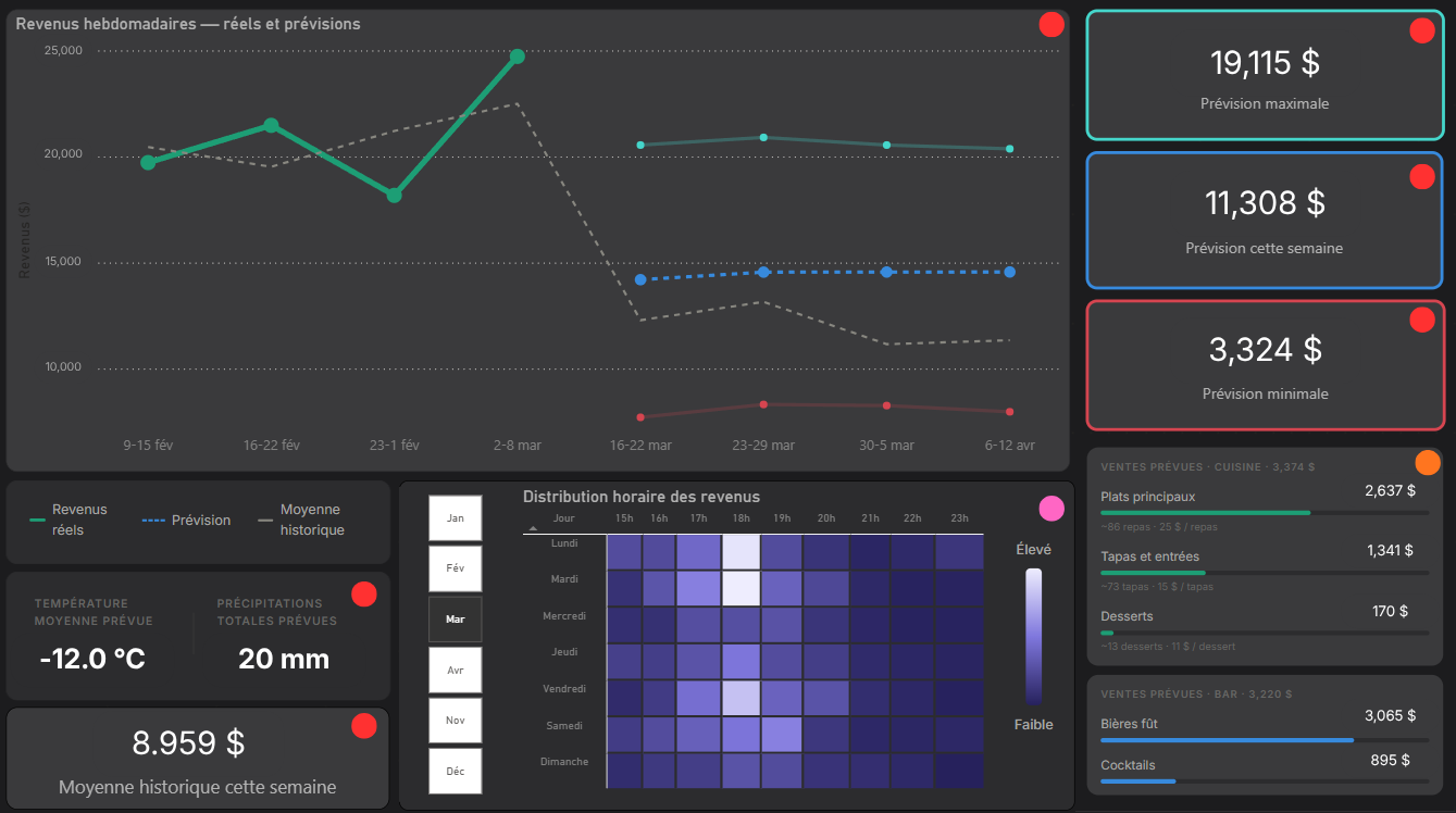
Weekly revenue forecast + KPI cards The main chart shows actual revenue (teal), the Prophet forecast (blue dashed), and the historical average (grey) side by side, giving the manager immediate context on whether the current season is tracking above or below expectations. Three KPI cards on the right display the forecast range for the upcoming week: maximum, expected, and minimum. The confidence interval is intentional, showing a range rather than a single number reflects honest uncertainty and helps the manager plan for both scenarios. The weather card shows forecasted temperature and precipitation for the week, the two strongest weather regressors in the model.
Hourly revenue heatmap The heatmap shows expected revenue distribution by day of week and hour of service, derived from Model 3. The manager can select any month on the left axis to see how the hourly pattern shifts, Saturday at 19h in August looks very different from Saturday at 19h in January. This is where the sunset effect discovered in the data becomes directly actionable.
Food and drink forecast panel A custom HTML Content visual, not a native Power BI component, that breaks the weekly forecast into food and drink categories. For each category it shows expected revenue, an estimated number of items to prepare, and a median price per item. This panel exists because a revenue number alone doesn't tell the kitchen how much to order. Translating dollars into estimated covers and portions is the last mile between forecast and operational decision.
Page 2 — Suivi des ventes
The sales tracking page is the operational review tool, where the manager looks back at what actually happened rather than what was predicted.
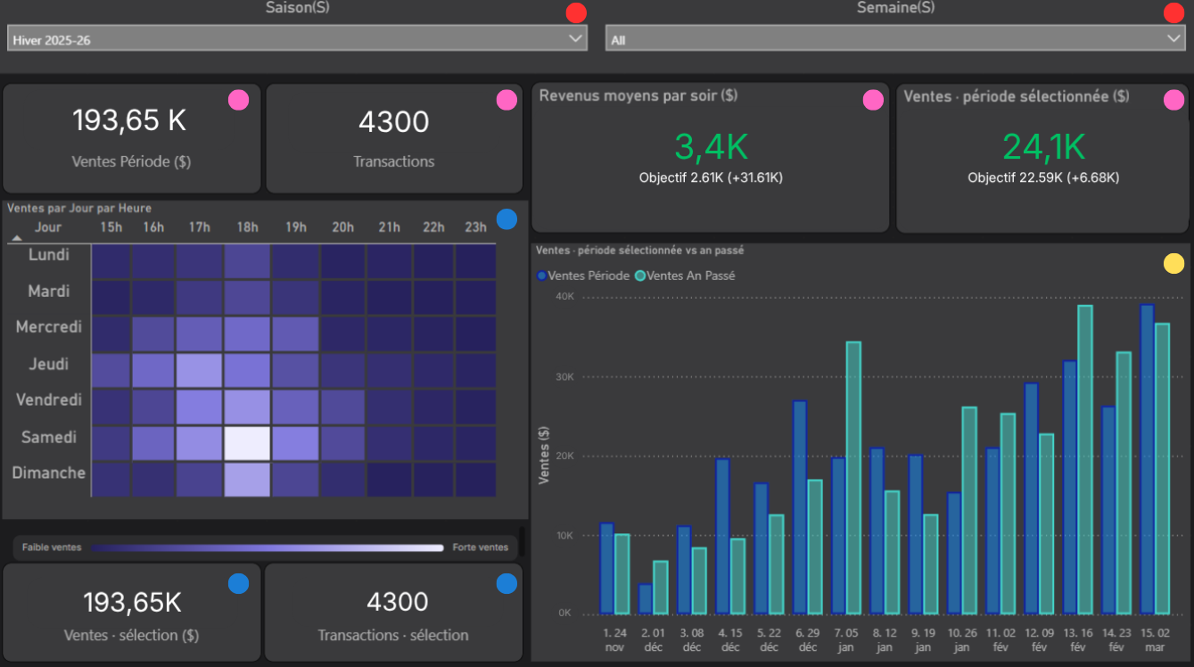
Slicers — season and week Two filters at the top control the entire page. The manager can select a specific season or drill into a specific week to compare performance across any time period. Keeping the filters at the top makes the page fully self-service, no data knowledge required to navigate it.
KPI cards Four cards give an immediate read on the selected period: total sales in dollars, total number of transactions, average revenue per night compared to the seasonal objective, and total sales versus the same period target. The green color signals above objective, making the performance status readable in under a second.
Hourly heatmap + transaction KPIs The heatmap shows actual revenue by day of week and hour, the same structure as the forecast heatmap on page 1, but with real data. It doubles as an interactive selector: clicking any cell filters the two KPI cards at the bottom to show total sales and transaction count for that specific day/hour combination. This makes it easy to answer questions like "how much did we do on Saturday at 19h this winter" without any additional filtering.
Season vs last year chart A weekly bar chart overlaying the current season against the same period last year. This gives the manager a seasonal growth signal that a single number can't provide, seeing whether the current season is consistently ahead or behind last year, week by week.
Page 3 — Performance du personnel
The staff performance page answers the management questions that raw sales numbers can't, not just how much was sold, but who sold it, how efficiently, and what their selling pattern looks like compared to the team.
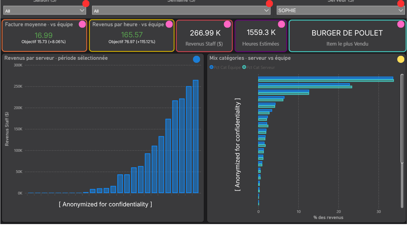
Slicers — season, week, server Three filters control the page. The server slicer is the key one, it lets the manager focus on a single server to review their individual performance in detail, or leave it on "All" for a full team overview.
KPI cards Five cards give a complete performance profile for the selected server or period:
Average bill value versus team average, is this server upselling effectively?
Revenue per service hour versus team average, the most meaningful productivity metric on the page
Total staff revenue for the period
Estimated service hours, derived from the gap between first and last transaction per shift, as documented in the dbt section
Top selling item for the selected period
The revenue per service hour metric doesn't exist anywhere in the POS, it's entirely derived from transaction timestamps in mart_staff_performance. It gives the manager a productivity signal that goes beyond total revenue, accounting for the fact that some servers work longer shifts than others.
Revenue by server The bar chart ranks all servers by total revenue for the selected period, anonymized here for confidentiality. A quick read on who is driving the most revenue across the selected timeframe.
Category mix vs team average The chart shows what percentage of each server's sales came from each category, overlaid against the team average. A server whose drink sales are significantly below team average is a coaching opportunity. The individual vs team comparison is only meaningful because both lines are always visible simultaneously.
Page 4 — Suivi des bières
Draft beer is one of the highest-margin product categories in a restaurant. This page exists because unit count alone doesn't tell the full story, a pichet and a verre are not the same thing. Volume in litres is the metric that actually matters for ordering and inventory decisions.
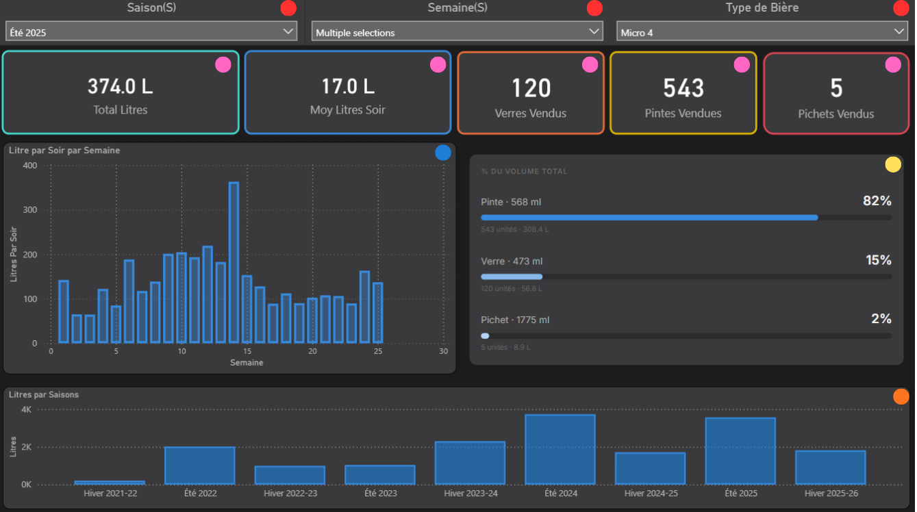
Slicers — season, week, beer type Three filters control the page. The beer type slicer is the key one, it allows the manager to isolate any tap and analyze its performance independently across any time period.
KPI cards Five cards give an immediate read on the selected beer and period:
Total litres sold
Average litres per service night, the ordering baseline
Units sold broken down by format: verres, pintes, and pichets
Volume is computed from Quebec standard format sizes, pinte at 568ml, verre at 473ml, pichet at 1775ml, making this a direct input for weekly keg ordering rather than just a sales report.
Litres by week A weekly bar chart showing volume evolution across the season. Useful for spotting demand trends, slow weeks, and the impact of rotating a new tap onto the menu.
Format distribution A breakdown of total volume by format, what percentage came from pintes, verres, and pichets. Shows not just how much was sold but how it was consumed, which informs glassware management and tap configuration.
Litres by season A historical bar chart showing total volume per season since opening. Gives the manager a long-term view of draft beer demand growth across the life of the restaurant.
Page 5 — Analyse par catégorie
The category analysis page answers menu management questions, what's selling within a category, what isn't, and what gets ordered alongside it. It's designed for both weekly review and seasonal planning.
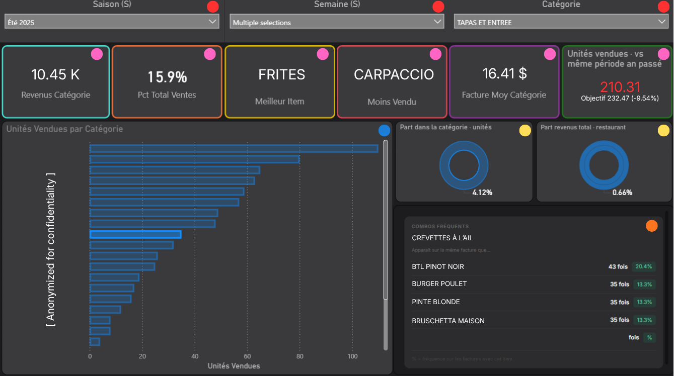
Slicers — season, week, category Three filters control the page. The category slicer is the defining one, selecting a category transforms the entire page to show only items within that category. This two-level navigation keeps the page clean without sacrificing depth.
KPI cards Six cards give a complete picture of the selected category:
Total category revenue for the period
Category share of total restaurant sales as a percentage
Best selling item in the category
Worst selling item, a direct signal for menu review decisions
Average bill value when the category appears on a transaction
Units sold versus the same period last year, the growth signal
Item sales bar chart A ranked bar chart showing units sold for every item in the selected category. The selected item is highlighted in a different shade, anonymized here for confidentiality. Gives an immediate read on the distribution of sales within the category and which items are driving volume vs which are underperforming.
Donut charts Two donut charts showing the selected item in context: its share of sales within its own category, and its share of total restaurant revenue. These two numbers together tell a different story than either one alone, an item can dominate its category while remaining a small part of total revenue.
Frequent combos panel A custom HTML Content visual showing the most frequent item combinations for the selected item, only pairs that appeared together at least 10 times are shown, filtering out noise. This is the market basket analysis from mart_item_cooccurrence made actionable: if Crevettes à l'ail is selected, the panel shows what else most often appears on the same bill. A direct input for upsell coaching and menu pairing decisions.
Page 6 — Recherche par item
The item search page answers a specific operational question: for any given item, who sells it best and how is it trending? It's designed as a coaching and training tool, a manager can pull up any item and immediately see which server is driving its sales.
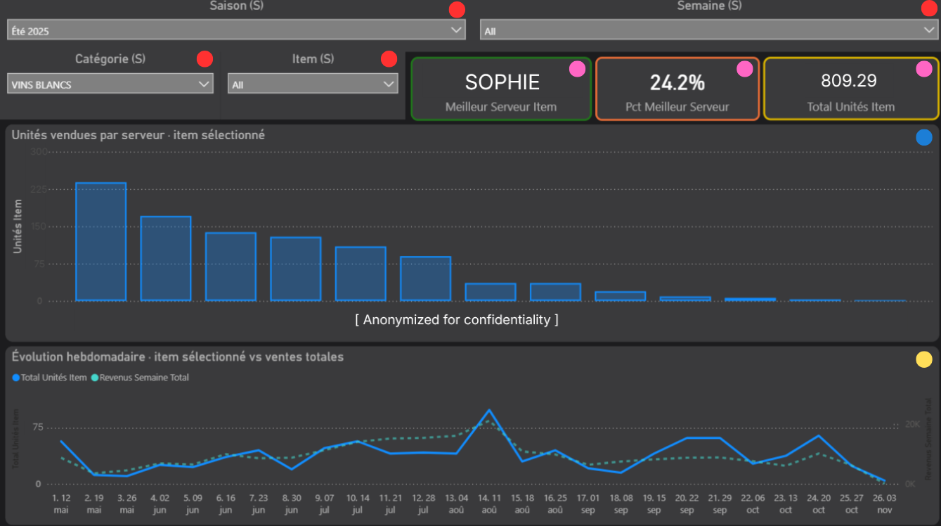
Slicers — season, week, category, item Four filters control the page. The two-level navigation, category first, then item, is a deliberate UX decision. With hundreds of items in the database, a flat item list would be unusable for a non-technical user. Selecting a category first narrows the item list to a manageable set, making the page self-service without requiring any data knowledge.
KPI cards Three cards give the key read on the selected item:
Best server for that item, which team member sells it most
That server's percentage of total units sold, how dominant they are relative to the rest of the team
Total units sold across all servers for the selected period
These three numbers together tell the coaching story: if one server accounts for 40% of a category's sales, that's someone worth learning from.
Units sold by serverA ranked bar chart showing how many units of the selected item each server sold, anonymized here for confidentiality. Makes the performance gap between servers immediately visible and gives the manager a starting point for upsell training conversations.
Weekly trend vs total sales A dual-axis line chart overlaying weekly units sold for the selected item against total weekly restaurant revenue. The key question this answers: does this item follow the general sales rhythm of the restaurant, or does it have its own pattern? An item that spikes independently of overall revenue is worth understanding, it may be event-driven, weather-sensitive, or tied to a specific server's schedule.
Technical decisions
HTML Content visuals Two panels on the dashboard are built with custom HTML rather than native Power BI visuals, the food and drink forecast panel on the forecast page and the frequent combos panel on the category analysis page. Native Power BI components couldn't achieve the layout and information density these panels needed. The HTML Content visual accepts a DAX measure that generates HTML dynamically based on the selected filters, meaning the panel updates in real time as the manager changes the category or week selection. It's more complex to build and maintain than a native visual, but the result is a layout that feels purpose-built for the use case rather than constrained by what the tool offers out of the box.
No transformation in Power BI Every number displayed on the dashboard was computed before it reached Power BI, in dbt, not in DAX measures. Power BI reads pre-aggregated mart tables directly and applies no business logic of its own. Beyond the architectural reasons covered in the dbt section, this was also a practical performance decision: a service manager who opens a slow dashboard will stop using it. Pre-aggregated tables load instantly. Complex DAX calculations on raw transaction data do not.
Known limitations
Weekly refresh only The dashboard reflects data as of the last Monday pipeline run. There is no real-time or daily refresh, for a seasonal restaurant operating on a weekly planning cycle, this is an acceptable tradeoff rather than a technical gap.
Single user The dashboard was built for one stakeholder, the service manager. There is no row-level security or multi-user access management. If the project were to expand to multiple users with different access levels, that would require a Power BI Pro license and a more structured deployment.
Forecast accuracy visible to the user The model accuracy page shows MAPE and prediction errors directly to the manager. This was a deliberate transparency decision, but it means the manager sees when the model underperforms. Managing that expectation required framing the forecast as a planning guide rather than a guarantee, which is reflected in how the confidence interval is displayed on the forecast page.
Full script breakdown and design decisions on GitHub